Okay folks, this is it! The first ever
Brent's Strictly Average Painting Guide, featuring Menoth's best 'Jack Caster, Amon Ad-Raza!
Let's spend a moment clarifying the basic premise: I'm not an expert painter, I'm a speed-painting competitive hobbyist. I love every aspect of this hobby, from the fluffy background of the Warhammer Universes to the slightly-smelly halls of a competitive tournament to the small room in my home where I spend countless pleasurable hours painting tiny toys.
As a blogger, no topic even remotely related to the hobby we all share has escaped my attention, but there are two topics I tend to shy away from. The first is trying to illustrate my method of painting and the second is trying to teach my brand of aggressive tactics.
While it may not sound like there's much left, that's only because those two things make up the vast majority of topics the average hobby blogger posts about. Am I wrong? Isn't it always
paint this way or
play this way?
There's nothing wrong with that, but I long felt the best way to ply my trade was to write articles which demonstrated my passion for the game, the hobby, and the community... after all, I'm neither the best painter nor the best player out there. If I've had any success, it's because my love of the whole shebang has shone through. That's what I think, anyway. Still I've always thought about tapping into my ideas on painting and playing...
...and this series on The Blood Angels: by Jawaballs is a big part of that: step 1 of 2, you might say.
Anyway, over-long intro notwithstanding, my primary goal is to write an entertaining article. If you read something that helps, great! If you want to help me, that's great too - I'm always willing to learn.
 |
| The general idea here is to layer up thin coats quickly. Inside-out is usually the best way, especially here since it's skin. This isn't really the first layer as much as it is the foundation for the colors that come later. |
 |
| The skin layer gets a wash of purple, the rest of the model gets its foundation layer. I love painting over brown, since the warm colors all live there. |
 |
| I build up the brown tones - FAST. Seriously, this is all about getting a decent quality quickly. I'm literally using a crappy, canvas painter's brush - the ones you get in varying sizes like 10 for 5 bucks. Don't glop it on though; over-brush it. In my mind, over-brushing is like a wet dry brush. It won't always leave a great texture, so it's not appropriate for flat armor like that of a Space Marine, but it's great for cloth and fur - again, like dry brushing. Then I layered on thin gold... and here's where the foundation helps. The browns will show up, giving the gold a decent richness... |
 |
| ...but but but..! It won't look appealing at all. Don't be discouraged; again, you're building up layers which you'll bring out later with washes and/or controlled layering. Notice here I'm not painting the chain on the left arm - it can't really be done properly, which means I'd have to clean it up later, which means I'm wasting time. As I'm painting, I'm enjoying the process... but it doesn't mean I'm not ready to paint the next dude. |
 |
| This is the same stage (the base metal) but taken from the rear point of view. Again, I'm trying to be neat so I don't waste time fixing things later, but the problems are glaring. Resist the urge to fix. Trust the process. |
 |
| The washes are probably the best thing GW has ever come up with and they've replaced most of the custom washes I used to use. As an aside, I think Devlan Mud is overused - don't neglect the others. I used Sepia on the cloth and gold, green on the gold, and black on the metal and some shadows. Let it dry completely. |
I never paint one model at a time. If I'm painting a one-off, like a character, I'll have another project running concurrently. The reason is obvious - I'm not wasting time twiddling my thumbs while paint is drying. Avoid downtime. If you've got only half an hour to paint, make sure your brush is moving for 30 minutes. You'll make progress.
 |
| Here you can see the washes are dry and the model is starting to take shape. The white is layered carefully. Now I'm using the good brushes. |
 |
| It's hard to see, but I'm also applying the base coat for the cloth Amon wears underneath his forearm armor. I'm using the Foundation Ochre, I believe - whatever the yellow one is! |
 |
| Here's the skin stage. I'm carefully layering on different stages. It becomes obvious when you compare this stage to those at the end. If you've done your foundation work properly, you won't be applying color on the edges - anywhere color-meets-color should be done; I'm layering mid and high tones. |
 |
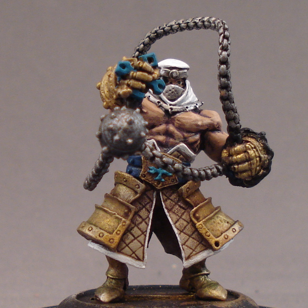
| The interior wrist straps are blue - it's hard to see until the final picture or two. Anyway, the skin on the back is easier to see. Use water in your paint and layer it on in thin coats. Don't over paint it or over think it - the process is the thing, right? |
 |
| In my army the contrasting color is the turquoise. I've had some criticism about it, but I really like it... and you're the one who has to live with the model, right? Anyway I only mention it because I had a composition problem at this stage. |
Part of painting is solving a puzzle; at its core, the puzzle is what color fits where? Look at the model above; I knew I was using white and red. So where? Well, white draws the eye in, so it made sense for the head scarf... especially since the eye has to look past the huge wrecking ball before it can see the core of the model. Since the head scarf is white, I decide I don't want to overuse it on the model, so I'll settle for constraining the model with white on the trim.
That said, red would have made sense on the trim, too. Triangles are another shape that draws the eye inward, and for some reason red works great with triangles... it's why the 3-spot technique works so well. Anyway, the trim points up, yes? It would have worked. Funny, I worked all this out before actually seeing the company's version of the model.
I was pretty gratified when I did!
 |
| Don't worry, no model looks that great magnified this much, certainly not mine! Still, it's important to see the layering; you're not meant to see the model this way, so don't obsess over it too much. I'll admit, the eyes bothered me no end, but I realized two things, 1) the eyes are actually hard to see on this model because of the cowl, and 2) I probably would only screw it up further since the shape of the headdress made it so difficult to paint. I left it alone. |
 |
| The red goes on in thin layers. The foundation shows through, providing instant depth - and it was light enough a color that the red is vibrant, not muted. I applied a few washes of a deep red in the creases... |
 |
| ...both front and back. Here you can see the final layers of skin, as well as my answer to another composition problem I didn't go into. Note the greens in the gold work with the reds on the kilt - ignore the Christmas curse, it's a myth: green and red are fine together most of the time. |
 |
| I paint the gem and the crosses. I highlight the metals. I layer the metal chain and fix the chain on the left arm. A big problem at this stage was fixing the individual fingers on both gauntlets - for some reason, they'd ended up appearing washed out and flat, so I quickly toned it down then built it up. I flocked the base. |
 |
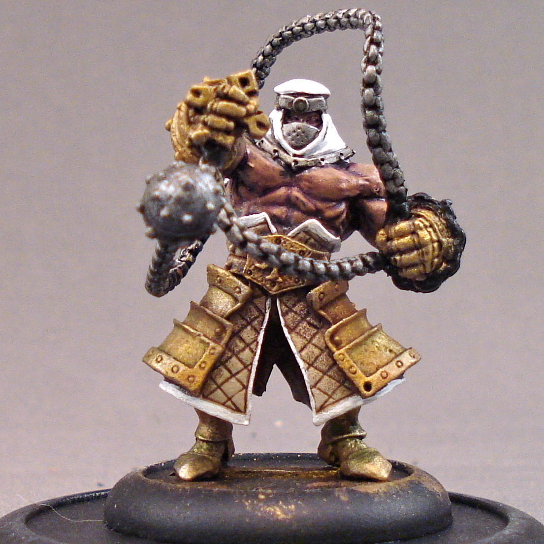
| And here it is. There are some minor imperfections, but truth be told they're only really noticeable in picture. Also, keep in mind the point here is to get an effect you're happy with without spending a stupid amount of time at the painting table - if you fix every nit picky error you'll never be done... primarily because there will always be something else you're unhappy with. That's the definition of obsession. |
So there you have it, my Amon Ad-Raza. I actually don't know how much time I spent on this model because, like I mentioned, I don't work on one thing at at time. It was somewhere between 2 and 3 hours - and probably much closer to 2. He is a character model, so he was worth investing a bit more.
What's more important is that I enjoyed spending the time doing it.
Okay, I'll admit something here, at the end... I'm not sure what to do with the morningstar... giant ball... thing. Right now its metal. It's dull and uninspiring. It's a composition problem that I've not quite sorted out - primarily because I was saving it for this article!
(That's a lie. I have no idea.)
Help me out!
Your thoughts and comments are much appreciated, ladies, gentleman, and Unicorns.










.jpg)
