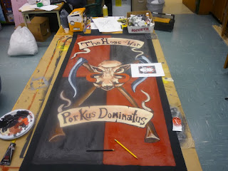
Hogs of war banner progress! Almost done.
Posted by
Jawaballs
at
8:00 AM
It's time to get this banner moving! Lots of progress today.
Previously I finished up the skull, mostly. I liked the line heavy drawing they sent me as an example and wanted to work that effect into my shaded skull. But I am not convinced that the two merged well. It was all shaded and skull looking, then I added in lines, and more lines and ended up with what I have here.
I need to look at it again after I have added in the rest of the design elements to reassess. I might end up repainting the entire skull. :(
On with the scrolls! I did not want to start painting straight onto my scrolls like I did with Helbrecht, and have to paint the scroll 5 times. So I traced my scroll on a piece of paper so that I could practice drawing out the letters by hand.
Here is attempt one. Fail.
Attempt two, better, but still a fail. Look at the hogs... it is straight and fails to use the space well.
Third times the charm?
Yup, after practicing it three times I managed to nail the letters on the scroll to the perfect size. I then painted them with black.
The bottom I did the same, but got it right on the first try with the paper.
One area that I need to fix is the little tears in the scrolls. The one above the H interacts with the H and makes it look funny. A little bleached bone will fix it. (I used Liquetex Unbleached Titanium)
I went for more of a light hearted font on these scrolls. I made the letters bolder than usual, and almost comicy.
Now for the crux! After doing some more sketching on paper, I came up with this final look for the crux. I ended up putting it in this location to fill space. I decided NOT to do the wings. I did not think they were an appropriate match for the hogs skull and scythes.
Here it is almost finished! I will paint a gemstone in the center of the crux, and I will put the state of Arkansas below the lower scroll as they asked and a few details on the tabbards on the bottom.
If you want a banner painted for you, my email is at the top right of the blog!
Jawaballs
Subscribe to:
Post Comments (Atom)


.jpg)
7 comments:
I actually think the skull looks great. The lines give an extra element of detail above the rest of the banner and draws the eye towards it's center. Which, lets face it, isn't a bad thing.
Hi Jawaballs,
why not made the writings on a PC (and print them) with a similar font? Just to make a trace...
nice job!
Thanks guys. Mastershaper, I prefer the freedom allowed by organic free hand. I like to be able to improvise on the letters. A perfect example of this is the K. I did not intend for it to look like that at all, but I think it is the best letter on both scrolls. And yah Dugatron, I am leaning in that direction. After doing more of the black lines elsewhere, I sorta like it. I just need to do some finishing touches on the skull and horns and some more lines. Thanks guys!
Oh and sorry for the comment moderation. I had to turn it on because some douche bag was trolling.
Looks amazing as they all always do Jawa!
"The Initiate" calmbeforewar.blogspot.com
if you dont mind me asking what material are your banners made from?
I make them out of heavy Duck cloth.
Post a Comment