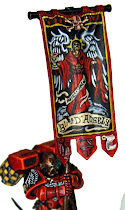
Here are pics of my first 4 new Assault Marines for my Nova Open army. Lets start by saying that they are not meant to win Golden Daemons. And remember these pics are taken from 3 inches away. They look very different from arms length, which is my goal. I am painting these to look outstanding on the table, and to be eye catching. I is my experience that armies painted in this "impact" style tend to do better than armies that stand up to close scrutiny even under an Ott light. While there is quite a lot of blending, I have also employed very bold brush strokes and hard edged lines.
Some times paint judges overlook perfect blending in favor of striking edging, no... often times. Lets be honest here, I have seen the girlfriends of TOs, ignorant to the skill that goes into painting and judging on taste alone, act as paint judges. Frankly I have to admit I don't really mind that. It is sort of an innocent equalizer. While there is quite a lot of blending, I have also employed very bold brush strokes and hard edged lines.
But lets look at judging a bit more closely before I get into these models. How often do actual painters really judge painting? Probably most of the time. But just how experienced are they? For example, do they know just how hard Yellow is to paint? Black Matt for example, scored terribly on painting at Da Boyz last year with his amazing Imperial Fist terminator army. (It won Players Choice when he unveiled it a few years ago at the GW GT in Baltimore, no small accomplishment.) Matt is the king of yellow and his models show it. But I can see how a yellow ignorant paint judge would over look their beauty.
Without tooting my own horn, not that I am afraid to do that, I can say the same about red. Blood Red is hard to work with. Especially compared to blue. Blue blends easier. But it is not just about paint qualities. Some colors are simply more eye catching. Salamanders, painted well with Snot, Goblin and Scorpion are more eye catching than Blood Angels painted well with Blood, Blazing and Fiery. The Green and Yellow-green are simply more eye pleasing than red and orange. What I am saying is that a red painter has to work harder than a green painter to get good results. Sometimes paint judges are ignorant of that fact. No... often times.
Part of playing the "painting game", is using the same strategies that I employ on the tables. Instead of playing an army that can do well against most armies, I usually play armies designed to beat the armies I suspect I will be facing the most, then try to hold my own if I get matched up against the others. I have found this to give me quite a lot of success. The same can be done with painting. Rather than killing myself trying to get a perfect red blend, and hoping a paint judge notices, I think that punching them in the face with well painted but bold edged highlights will serve me better.
It is my belief that paint judges are more likely to be wowed by the army that simply looks good on the table, rather than the one that may be more technically sound. So I relent.
In remaking my style, I have decided to draw on what I have done in the past, and mix it with what I am doing now. I won my first few best painted awards using a simply extreme highlighted scheme. White prime, blood red base coat, Blazing Orange highlight, Fiery orange finish. Impact, eye catching, winning.
I got away from that in my endeavors to win a Golden Demon. I entered a beautiful squad in the competition, painted to the best of my then ability, utilizing extreme highlights, only to watch every demon of the day go to armies that were dark, muddy and lacking of bold highlights. So I changed my style, turning my back on the highlight and attempting to use blending to show the edges of the armor, with little to know highlights to speak of. I can say that the armies were technically painted better. But on the table, they looked just dark and boring. I stopped winning painting awards, watching them go to guys who paint like I used to. Talk about banging your head against a wall huh?
That brings me to now. I decided to bring back the bold Jawa highlight. But I am not forgetting what I learned with the attempts at blending. In these most recent models, I am attempting to do both. What it comes down to is I am painting each model twice.
First, I am spraying them black. Then I am using Dragon Red. When used carefully, the paint is the best. The DR alone starts off my dark blending. From there I use a mixture of Blood Red and Valejo Glaze Medium, probably about 50/50. Sure the glaze further dilutes an already translucent paint, but that is the secret. It allows me to build up layers and layers of color, letting the dark under coats show through while making the red on the edges more opaque. Look at the legs and feet of the third picture.
Now, at this point the models are already good. I could maybe add bit of orange into the mix and continue blending, but that is where I switch up. I go bold instead of subtle. After I layer on Blood Red, probably hitting some spots with 5 or 6 layers, I apply Blazing Orange, using the same glaze mixture. And I do two or three applications of BO. Then I edge with thin lines of Fiery Orange. It is now discontinued, but once I saw that they did that, I went and bought about 8 pots. When it dries up I will weep.
Then comes my secret weapon. I use a special pot of Baal Red. BR tends to have a mat, dull finish, but for some reason this pot I have leaves a very rich satin finish. Perhaps a mess up in the mixture that day at the plant, who knows, but you can see this nice satin effect on the models. It gives a chewy luster to the models. People ask me how I get that cherry red look, well, there is the secret. Finished of course with Valejo Satin Varnish. (I have not applied VSV yet.) I hope I finish this army before I run out of Baal Red!
So after I hit it with my satin Baal Red, I go back in and bring out the edges again with a touch of Fiery Orange. And that is how I get the effect that shows up in these four models! The power sword is stolen right from Tim Williamson. The angel wings, which I managed to improve on by pic three, which is the fourth I painted, was stolen from Tom Schadle's Dante painted for the Heroes project. I wish I could keep that model. :) Learning from our peers, by emulating them, makes us better ourselves. I think I actually improved on Tim's power weapon with a richer blue. My application was a bit clumsy, but I will get better with that on the next few tries. There is definitely no confusing the sergeant in this squad!
So now the questions for you. What do I do with the bolt pistols? While I like the flamer's red casing, it sorta gets lost with the rest of the model. Should I introduce blue on the guns? Does any one have any recipe suggestions? The other day some one suggested some sort of color on the tips of the wings. I think they are right, but the question is what? Maybe a touch of black? I will be keeping the frame of the wings black and edging them with grey.
My first goal is to get all 40 of these marines painted up to this level. Then I plan on pushing them beyond all together. Hazard lines on the chain swords, further highlights on the white feathers, squad markings and what have you. I won't be putting the squad marks on their knees because of the cool detailing, but I will be able to put it on the jump pack.
Any way, I time to put these four away for a couple days while I wait for my reinforcements from Spikey Bits. I have no more SG models! Thats ok, I can focus on finishing a terminator commission, hopefully tomorrow. One thing I can say is that those terminators are reaping the benefits of my new style! :)
Don't forget that there is still time to donate for the Heroes project. I will be posting up the last of the pictures of the Blood Angels army Monday morning. The transport is here and they look outstanding. I will also shoot some video of them on Moday as well.
Jawaballs


.jpg)