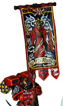
Pre Heresy World Eaters full size banner!
Posted by
Jawaballs
at
10:09 AM
Here is the first draft of a new banner commission. Pre Heresy World Eaters!
He wanted the basic World Eaters logo, the chaos star pointed circle with the jaws eating the world, with maybe some chain axes crossed in the back. 8th company. But he was not sure and left it up to me! I don't know much about preheresy stuff, but I don't know if the World Eaters adopted the pointy chaos star stuff until after the heresy.
So while the pointy "Gothic" design around the circle enclosing the world may be accurate, for 31st mil Space Marines, I just don't know. So I decided to go with a more animalistic jaw, using a sharks jaw bone as a prompt. The Chainaxes need improvement, but I just put them in for place holders, and I need to organize the layout a bit better.
The banner itself is light blue. The field around the logo is going to be black, on the blue banner, with white trim between. The standard bone colored Jawa Scroll and decorations on the tabs on the bottom. Is this looking too Space Sharky? Should I go more with the pointy circle design?
Thoughts?
Coming soon:
Redemption of the Fallen Charity project
Full sized Blood Angels, Lamenters, Black Templars and Custom banners
Eldar Ulthwe
Lamenters back on track
Subscribe to:
Post Comments (Atom)


.png)


.jpg)
4 comments:
I like both ideas but i think u should go with the pointy circle design but not with all the spikey bits.
Hey Jawa, concept looks good. I think the Shark Jaws is an interesting take. I', more of a fan of the globe inside not having any blank space around it though. The globe barely fitting on the closing jaws in the traditional symbol works better for me. A little more dynamic and gives quite a bit more weight behind the symbol. The blank space makes me think World Swallower vs. Word Eater!
Can't wait to see how it comes out!
I'd love to see the banner with the traditional symbol. If you go to the forgeworld website there is a transfer they sell for PH world eaters. That should give you a bunch of ideas of other iconography that would work well with your design.
Yah, after conferring with the client he wants something more like the World Eaters symbol with the round circle. Easy enough! So the final design will have the round spikey circle with a less "earth" like planet in it's mouth. :)
Post a Comment